DFI Retail Group
A bold, contemporary look that means business
After rebranding supermarkets Giant and Mercato we had an exciting opportunity to help create a new, contemporary brand for our client, DFI Retail Group. As a pan-Asian business with an impressive portfolio of brands (including 7-Eleven, IKEA, Mercato, and GIANT), our goal was to rebrand it to make it more relevant and future proof.
Client
DFI Retail Group
Sector
Retail
Location
Asia
We partnered on
Brand vision
Brand purpose
Brand personality
Logo design
Brand guidelines
The brand
The confident, understated simplicity of our brand approach represents the diverse roster of brands across multiple channels.
From a brand strategy perspective, capturing the essence of their people and customer-centric spirit is key. This approach is evident throughout the rebranding’s execution and company communications.
Overall
This rebrand is about confidence and inclusivity, embracing the diversity of the portfolio of brands. Each letter style highlights different elements while the colour palette is anchored with confidence and trust, while at the same time it brings a warm, human feel.

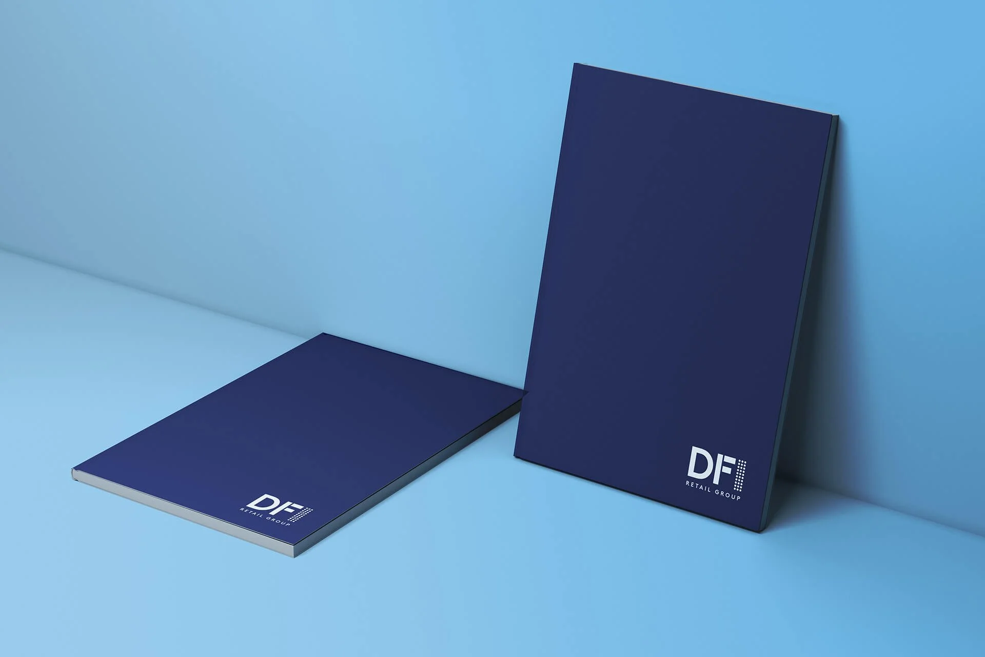
Logo
The ‘I’ purposely has slightly less prominence to give more focus on ‘DF’, referring to the original Dairy Farm namesake. The group of dots which make up the ‘I’ represent the inclusivity and collaboration of the brands.


Colour
The palette is contemporary and vibrant, yet authoritative – reminiscent of the brand’s heritage. The dark blue gives strength and credibility supported by a confident red and fresh light blue.


Visual assets
The red line not only lends a feeling of confidence; it acts as the thread that ties all the brands together, like a timeline capturing their heritage. Practically, it’s used as an accent to page layouts and as a dividing device which is smart, minimal, and sparingly used. We developed an iconography style that’s unique and ownable which features the use of brand colour, rounded corners, and logical, grid-like construction.
Creating this bold, new brand identity for DFI has been extremely rewarding for our team, it’s humbling to know that something we’ve created will represent the brand as it continues to grow for years to come.


“We really appreciate the great efforts from Tickety Boo Creative in this project. The refreshed brand not only captures our brand essence, but also effectively represents our current positioning and where it’s going in the future.”